The creative process of “Collectivization”.
Collectivization, 2024, Oil on aluminium panel, 50×100 cm
In this article, I will try to detail as much as possible the creative process of making “Collectivization”, one of my latest oil paintings executed on a custom-made aluminium panel.
I created a table of contents so you can jump to any chapter you prefer, but I recommend sticking with the full read to fully understand the experience and present material.
1. Concept and overall presentation
I wanted the overall vibe of this painting to be one of a contrast between calm and distress. During the development of the image, I kept thinking about the Cold War. A period of lurking danger but with one of the longest periods of technical peace in recorded history. By coincidence, through the process of creating the sketch I was listening to a series of podcasts about dictators, and many of them were referring to the Soviet era. That inspired me to relate the young lady with the traditional Romanian blouse from the painting with the historic process of Collectivization.
The process of Collectivization took place in the USSR and other communist bloc countries such as Romania in the first half of the XX century. In Romania, it began in 1948 and it was a process of taking away the rights of ownership of farm land and other production means from the rich peasants by the state and creating a new form of collective ownership, like collective agricultural institutions. Of course, this process came with a lot of violent enforcement. I heard stories from my mother when I was a kid about her grandfathers suffering in this matter.
The collectivization process ended in 1962, so all this was happening during the first part of the Cold War, which I tried to highlight.
This is not a historical painting; I just used this concept to illustrate an emotion, and the title gives a clue to the main feeling I am trying to evoke. This painting also draws upon my other works in the past, showing the relationship between human and machine, an ongoing symbiosis in our current lives. I will explain my thinking in much more detail as we go along in this article.
The sketch for this painting came to fruition as a drawing from the subconscious, which was then further developed with the idea of Collectivization in mind. The painting was created on an aluminium panel of 50x100cm (Vid. 1), which I custom-made (chapter 4). It was painted on an oil ground with oil colours using different mediums like Alkyd and Stand oil thinned with Turpentine or Mineral Spirits.
Vid. 1 - Here are some videos, originally made for Instagram, to show the painting and its details.
Development of the sketch
In the middle of 2024 I had the urge to make another painting on a custom-made aluminium panel, so I went into my sketch book to search for some inspiration for this new project. I consider each painting as a standalone project because the process implies many stages and takes my full attention for months, no painting is considered just routine. Through my handful of sketches, one peaked my interest, it was a sketch I made a few months earlier from my imagination. img. 1
Not often does it happen that I begin a painting with just a simple doodle, with no clear plans or direction in mind as the concept is concerned. This way of starting is a unique experience that allows for spontaneity and creative exploration, making the process both exciting and unpredictable. That is the case with Collectivization. Usually, I have a specific concept in mind before I begin the process of sketching my ideas, but not in this case, this made this one project a bit more special.
For this initial sketch, I just sat and drew something from my imagination. As I went along, I found that my present state of mind wanted something cozy, like a still life, with some nostalgic feel, combined with an old tech, like a CRT monitor. This initial vision guided me as I translate my thoughts onto paper.
I felt quite pleased with this direction I had chosen, so I decided to bring it into Procreate on my iPad, where I would have the opportunity to develop it further and explore its potential in greater detail. I wanted to integrate a detailed still-life. I first went to the market and eagerly bought a colorful bunch of fresh fruits. Once again, I had no concrete arrangement in mind just yet for the fruits; I simply knew that I needed to collect a generous stack of fruits. My goal was to select 2-3 of each fruit that looked particularly good. I would then take my time to carefully consider how I wanted to artistically arrange them in a way that would convey my intended vision later on. I used my iPhone, a direct white light from a flashlight, and a blue side light, and took this photo, img. 2
In img. 4, I already uploaded the still life and my sketch in Procreate and I began the process of photo bashing. This is when I basically make a collage of my available photos to establish a composition. I also thought that an atomic explosion (Img. 3) displayed on the monitor would create an antithesis. I also established that this contrast of safety/danger should dominate my mind while thinking of further developing this sketch.

Img. 1 - First doodle, nobody knows what this is yet. 8×8cm

Img. 3 - Reference for the Atomic bomb explosion. Sourced from google.

Img. 2 - Still life reference. Sourced from the local market.

Img. 4 Procreate photobashing
The Study
Generally speaking, the next stage after the line sketch is the study, which is basically a more advanced sketch where the artist decides on the values, colour scheme and final touches before starting the actual painting.
While working on the initial stage of the sketch, I decided to make this into a “landscape” format painting. This is because my last painting was in a 2/1 format on canvas, and I really enjoyed it, I find it more fit to tell a story. Another advantage was that I could use the entire sheet of aluminium that was available to me at my local hardware store, they come in 100x50 cm sheets, so a 2/1 aspect ratio. Really nice! Ill show you how I’ve made the aluminium panel itself later on.
You can see in the Img. 5 the mid-stage of the Study. This is a photo taken straight of the iPad interface. The figure is already integrated and I’ve added the machine that keeps her alive,. I decided on some colours and sketched out a group of small male figures that want to come out of the monitor.

Img. 5 - Mid-stage of the Study
I also wanted to bring some eastern European elements in. I added the classic fish on the “mileu” on the TV, which is something typical of the soviet era decoration in Eastern Europe (Img. 6). The carpet on the background wall is in an oriental style, Persian-like, which is also something very common in the Balkan region. I wanted to recreate some of the geometrical elements on the carpet, to make it more “mine”, so I reimagined it as an electrical board.
Probably my favourite element in this picture is the girl’s blouse called “Ie” in Romanian. It’s a traditional blouse used for special occasions. This one is actually hand-made by my mother and was worn by my partner in this shooting.(Img. 8)
The “heart” (Img. 7)was something I toiled with because it might seem a bit gimmicky, but I really wanted to show that the machine feeds her somehow. This seemed Right. I could not resist and added one of my favorite laitmotif, the cast iron radiator on the right side. This for me is another nostalgic element which I often bring into my compositions.
Lastly, the books and newspaper were added to convey that safe feeling I was talking about earlier, I think they bring a cozy feeling in any space. Initially I wanted them to be completely desaturated, as if dead. They only remind the viewer of potential knowledge but are not accessed. I was inspired for this from my actual experience when I was a kid. I knew many families that had full libraries but didn’t read them, they were just for show.

Img. 6 Reference for the Fish and “mileu”

Img. 7 Reference for the Heart.

Img. 8 Reference for the main figure
Probably the most intense job I had to do for this study was the modeling of the little male figures that want to come out of the monitor (Img. 9). The figures are imported from Daz and modeled in Blender, an open source 3d software (Img. 10). They were particularly difficult because I had to take into consideration their position within the monitor and the 3 light sources, orange from behind, blue from the bottom right, and White from the left side.. All these had to be good enough to give the illusion that they belong there.

Img. 9
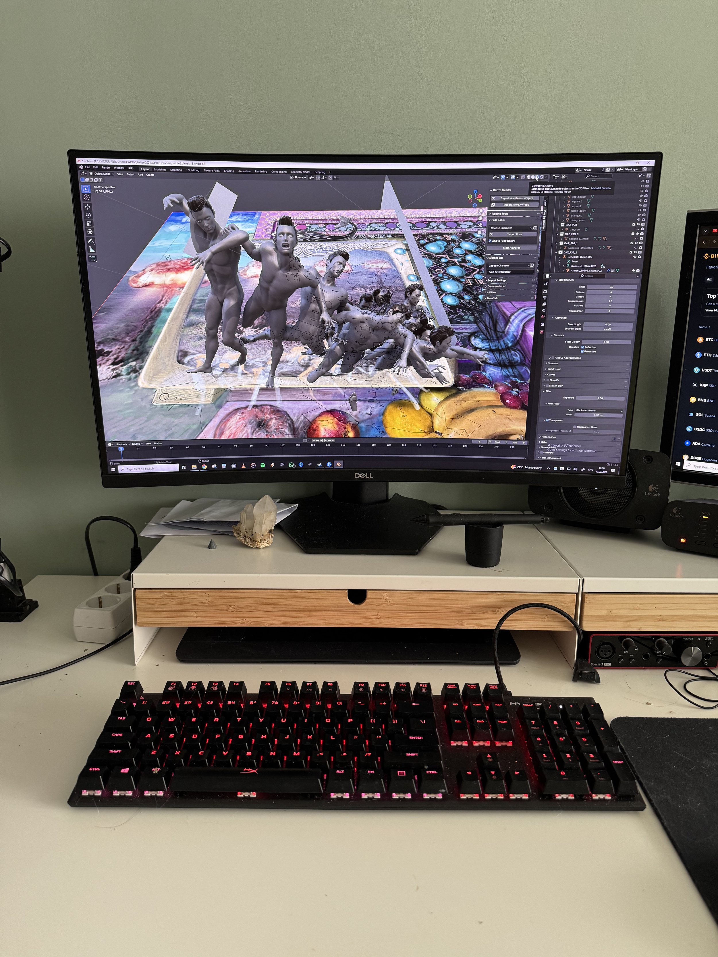
Img. 10
After a few days of tinkering with this sketch in Procreate, I reached a stage that was good enough for me to advance to the actual painting. For me to decide when to start painting requires that I be certain about the structural elements and values. The colour scheme is also an aspect I want to be decided upon in this stage, but it is not as important as the structure and values, colour can be modified a lot easier while working on the actual painting. Choosing the form factor and the big shapes of the composition was a priority; other details would be added later as the paint dried.
In Img. 11, you can see the final sketch before painting. I like to add glass elements whenever I can, I love how transparent objects look in real life, I enjoy painting them and I think they add a bit more flavour to the final image. Transparencies always impress.

Img. 11 The final Sketch used as reference for the oil painting.
Building the aluminium support
It's time to focus on one of my favorite parts of getting ready for a new painting.; The making of the aluminium panel. The process is simple but takes a lot of attention to make it high quality. First, I buy the actual sheet of aluminium. In the past I used 2mm sheets with L profiles on the back for reinforcement, but for this project, I want to experiment with a 1 mm sheet and with square profiles for reinforcement, which are more rigid and can compensate for the thinner sheet. The profile is manually cut at a 45 degree angle (Img. 12)
To attach the reinforcement, I use 2 epoxy resin components, which I believe is ideal for this application. The bond is strong and flexible enough to withstand any reasonable stress. For a good bond, I prepare the surfaces that will be glued together with some rough sandpaper and a very tough metal tool to create deep indents in a crosshatch pattern. I apply the glue thinly and I use as many clamps as I can to get a very even pressure bond (Img. 13). Although this takes about 15 minutes to harden, I leave them for at least a few hours.
Welding would be overkill since the actual resistance of the bond is not important, on the contrary, if it is too strong the panel itself could be more susceptible to physical damage due to inappropriate handling or dilatation. It’s better to have a bond that can break in case of stress. Welding could also damage the relatively thin sheet.
After all 4 profiles are glued to the sheet, I use an angle grinder and an orbital sander to remove any excess glue from the profiles and to give a very toothy texture to the surface of the panel in preparation for the ground layer. As a ground, I use an oil-based ground which is also ideal for a canvas if it’s going to be painted with oil paints. I also used Acrylic ground in the past and saw no problems with it either, I just prefer to use the oil-ground because it dries to an unabsorbent ground rather than absorbent like the acrylic one.
This painting was not made with the Blog in mind, so my documentation was very random, I’m lucky to even have these photos. I probably took them to show to my family what I’m up to. This will not be the case with future painting as I am now determined to show more of my process in detail here.

Img. 12 Manually cutting the square profile at a 45 degree angle.

Img. 13 Clamping the square profile with the aluminium sheet.
The Underpainting
For this painting I used a technique called the “Flemish method” that is similar to the “Venetian method”. Both are a succession of thinly applied layers, each layer has a specific function. The first one is the “imprimatura” which is a medium value tone, like a light brown, which has the function to “kill” the bright white of the support and give an overall undercolor to the image. This is critical for allowing the painter to better judge the tonal direction of the painting as he progresses. This layer should consist of a fast drying pigment, like “Siena” or “Umber”. The “imprimatura” must be left to completely dry for at least one day.
The next layer is a monochrome undepainting, establishing the general values, the brightest white and the darkest dark in the whole image (Img. 14). At this second stage I focus only on values, not colour. I mix my paints on the glass palette, using only Underpainting white and mineral black. Underpainting white is a basic titanium white + litophone and linseed oil. Lithopone makes it more opaque and linseed oil makes it faster drying. Usually Titanium white is made with Safflower oil to be more resistant to yellowing, but this is not my concern at the Underpainting stage. The mineral black is based on iron oxide and thus is a fast drying pigment with a warm tint to it. At this stage I avoid using any medium in my mixes, I just use some solvent to thin out the paint. If I want this to dry fast, I might add just a bit of Alkyd medium, but it’s better to keep it medium free at this stage in the painting. After I lay down the Underpainting, I’ll wait for a few days to be sure that it is completely dry.
Now comes the actual painting.

Img. 14 - A shot from the studio showing the finished Underpainting.
The painting process
For this painting, since it has so many details, I wanted a more efficient way to fully paint the objects without thinking of later corrections. I wanted to be done with each object in one sitting. In a way, I wanted to paint “alla prima” but with a black and white foundation to guide me (Img. 14 & Img. 15). Having a very detailed reference picture made earlier makes the process a lot more relaxing, having all the values and hue decisions made before painting. The hours put into making the sketch pay off in the long run. I think of the Sketch/Study as an investment in time.
This whole painting was painted over the oil ground and Underpainting using Oil Colours with different mediums like Alkyd and Stand oil thinned with Turpentine or Mineral Spirits. Nowadays I use less Turpentine to avoid stinking up the studio, preferring the Odorless mineral spirits. I premix most of my colours on a glass palette with a neutral background color. Glass makes the palette easy to clean with a sharp tool and the neutral background is useful for seeing values and hues better when mixed. I always use a palette knife to mix a bulk paste of colour to avoid ruining the brushes. For the painting itself, I mostly use Red Sable and soft synthetic brushes.

Img. 14

Img. 15
The entire process was straightforward, just like you see in the videos (Vid. 2). It took me around 3 months to fully paint every object. At some points during the painting process, I had to stop and let the painting dry to the touch. So much of those 3 months is just dead time. Although I tried to paint each object in one sitting, corrections had to be made in some cases. For this to work, the surface needs to be dry, and allow for gazes or full paste to be applied over.
The most demanding part of this painting was working the small male figures (Vid. 2 middle & Details 1-8). For this part of the painting I wanted a “Trompe-l’oeil” effect, the figures should give the impression that they’re coming in from another world inside the CRT screen. This was my objective, the mimesis approach, for this, I had to pay great attention to the subtleties of hues and, more importantly, of values in the reference I’ve made before in Blender.
In the case of the fruits (Img. 14) it was a lot easier because the fruits themselves are so different from each other, this allows more room for error in achieving realism.
Vid. 2 - Painting progress montage.
Although my objective is to paint smooth without texture, when you zoom in and look at the painting using a directional light, you can very clearly see the brush marks, best seem in Detail 4 below. This could be something interesting to some people. I personally like to see this only when looking extremely close and focused.
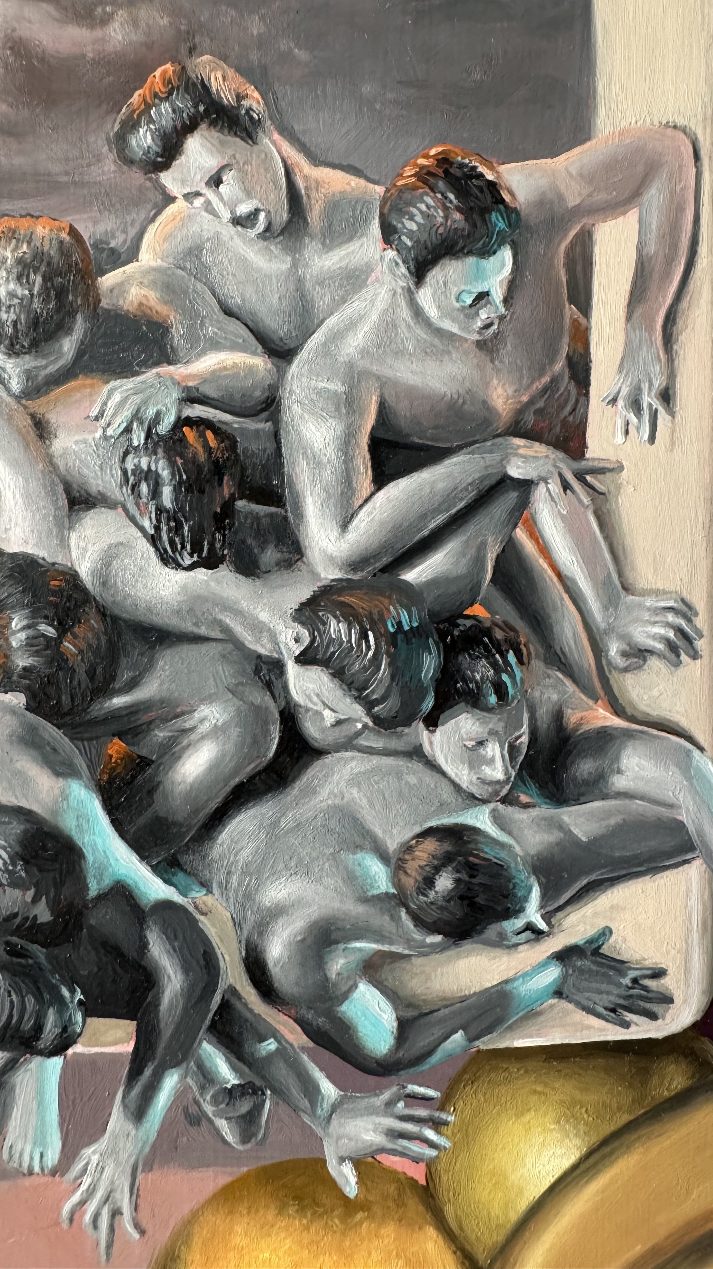


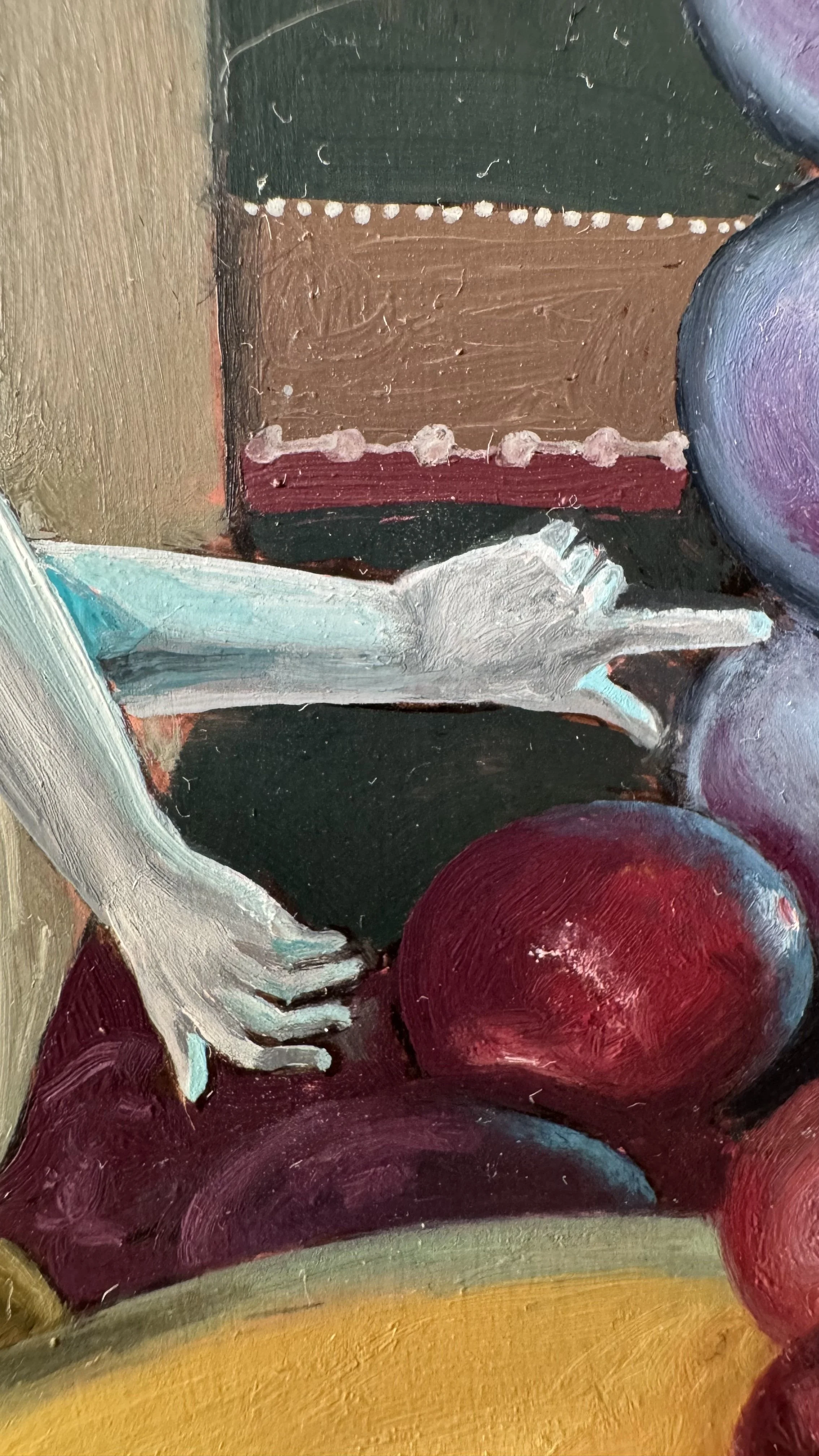

Somewhere close to finishing the painting there was something that really bothered me; the right side of the painting seemed empty and unbalanced. This revelation, combined with the fact that her position in this painting so far had an awkward position that I didn’t see before bothered me even further. So I decided I must add her right hand into the picture to balance the image. Her right hand grabbing the radiator seemed the obvious way to go, this also balances the painting and it also gives a bit more meaning to it.


The painting is now in my studio, patiently waiting for the polymerization process. For me to be able to varnish the painting, it is very important to wait between 6 and 12 months for the painting to be completely “dry”, otherwise there can be damage to the painting surface in time. This “drying”, or more correctly “polymerization”, happens when exposed to the Oxygen in the air, this is what hardens the oil paint. This process, in its majority and intensity, happens in the first year after the painting is completed and continues for many years at an extremely low intensity, but the latter can be ignored.
I will update this blog when I finish the varnishing process.